iOS
Architecture Overview
We are in the middle of the process of slowly converting all UIKit features into SwiftUI views. Therefore, the UIKit documentation below shall be seen as deprecated.
SwiftUI Architecture
Just like a solid foundation determines the success of building a new house, a good architecture paves the way for a successful project. Given the number of features in this project and the high fluctuation in the development team, we were determined to contstruct and properly document a future-proof architecture for the iOS app.
Lots of thoughts have been given to how and why to strucutre and layout this component. We researched, learned and tried out several architecture styles, including MVVM, VIPER, REDUX, FLUX and Feedback. These are all popular styles for mid- to large-sized applications. We also took a lot of advice from Apple’s WWDC documentations and screencasts. In the end, we settled for something more simple and elegent, namely a well-structured MVVM (Model-View-Viewmodel) pattern. We would like to list the reasons for that below. First, SwiftUI is still rather new and under active development, which means things change rather quickly. In accordance with that, we preferred not to include an external library to handle state management or user actions. Second, the code overhead should be rather small, wherease some patterns require massive Reducers or alike. Third, SwiftUI already has a lot of state management built-in, which we would like to use to our advantage. Further reasons and explanation can also be found in the essay Clean Architecture for SwiftUI.
Before we begin, take a step back and refresh your memory of the global Project Structure of the project. Now, let’s look at the overall structure of the iOS component.
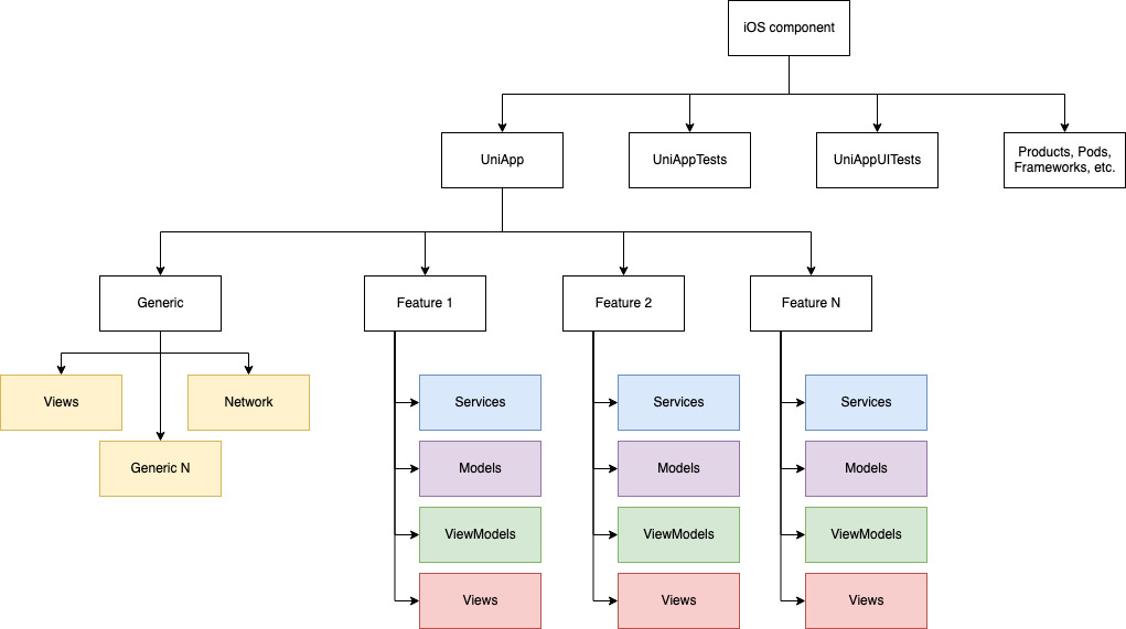
At its core, we split the application into modules regarding the different features (see Overview). Each module is then structured into Models, Views, ViewModels, and Services. The Generic module holds common view components and interface implementations (e.g. for networking).
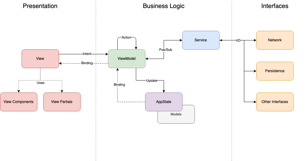
A Model is a struct that represents an atomic entity, most commonly of something delivered through our API.
Each Model has an associated ViewModel, which handles user intents (e.g., when the user interacts with a button) and can dispatch calls to services.
A Service provides easy access to system interfaces or network request to our API.
The View is a SwiftUI view that is only concerned with representing the current state to the user. It explicitly does not have any function implementations for handling user intents. However, it can include computed variables and functions that are entirely user interface related (e.g., setting up a swipe gesture).
The AppState is the single source of truth for the entire application. It is passed around between views as a environment object.
Tooling
Note
short description of team specific tools
Testing
In order to test the app on the phone, you simply need to open XCode, plug iPhone to your computer and select your phone as a device. If it says that there is no access to this membership resource, it means you need to sign in at the App Store with the data of the project owner. After that you should be able to run the program again and use your private iCloud.
How to start a new feature
Note
describe how to create a feature
Note
to be done!
Quality Control Measures
Code Style
A consitent code style is important, so that all developers feel at home, even when working on parts of the application not implemented by themselves. We have agreed to use the Google Swift Style Guide. To better enforce the consistent style and conventions, we use SwiftLint.
CI Runner in IOS
Note
The CI runner can only operate on a Mac. When pushing to GitLab, the CI runner is executed on one of the Macs located in the Software Engineering Pool. The documentation below describes how the CI runner can be set up on this Mac. However, the CI runner is currently out of order since the Mac was shut down and used for another project. Consequently, it has to be re-initialized before it can operate again.
This article covers the main aspects about the CI runner for iOS. In contrast to Android, the CI runner on iOS has to run on a local server, the gitlab runner is insufficient since XCODE only works on a MAC. Consequently, the CI runner has to be setup on one of the MACs in the pc pool of the SE institute. For this, a separate user was setup on the “left” MAC in the pool (username “GitLab CI Runner” or something like that). For the pipeline to work, it is necessary that this user does not get logged out and the MAC is never shut down completely. Putting the MAC into sleep mode does work though.
Manual Installation
Remove the old runner if necessary from GitLab (Log into GitLab -> iOS -> Settings -> Ci / CD -> Runners -> Remove Runner)
execute following commands in the terminal of the “GitLab CI Runner” user
sudo curl --output /usr/local/bin/gitlab-runner https://gitlab-runner-downloads.s3.amazonaws.com/latest/binaries/gitlab-runner-darwin-amd64
sudo chmod +x /usr/local/bin/gitlab-runner
cd ~
gitlab-runner
install gitlab-runner start
Homebrew Installation
brew install gitlab-runner
brew services start gitlab-runner
Post installment
After setting up the runner, go onto GitLab and start a pipeline. The pipeline might fail. If this is the case, check for the error messages when the build is failing. Here are some possible solutions, but since there might be some errors we did not have, this list might be incomplete.
install homebrew
install cocoapods
brew install cocoapods
install xcpretty
sudo gem install xcpretty
Unable to find a destination matching the provided destination specifier:{ platform:iOS Simulator, OS:12.2, name:iPhone 8 } -> If this error occurs, check for the installation of the simulators. If the simulators are installed, check for the iOS versions they use and which iOS versions are used in the gitlab-ci.yaml file in the project. Change the versions of the gitlab-ci.yaml file to fit the iOS versions of the installed simulators.
UI Testing
This sections takes a look on how to swrite UI tests with SwiftUI. All UI tests are located in “UniApp -> UniAppUITests -> UniAppUITests.swift”
Cheatsheet for testing: Cheatsheet
Before each test, the setUp() function is called.
[UniAppUITests.swift]
...
       continueAfterFailure = false

       app = XCUIApplication()
       app.launchArguments.append("--UITesting")
       app.launch()
...
If a tests fails, it is likely that the app is in a wrong or unexpected state. To prevent the tests from continuing to be executed, the continueAfterFailure boolean is set to false. With the “–UItesting” argument the app starts in the “default first launch” configuration, implemented in AppDelegate.swift:
[AppDelegate.swift]
...
func application(_ application: UIApplication,
                    didFinishLaunchingWithOptions launchOptions: [UIApplication.LaunchOptionsKey: Any]?) -> Bool {

       // start app as if its the first launch for UI tests
       if CommandLine.arguments.contains("--UITesting") {
           firstLaunch = FirstLaunch.alwaysFirst()
       }
...
This makes sure every time a UITest is performed, the app is in the same known state.
Example Test
This UITest tests the News part of the “News/Events” feature. First, the corresponding button on the tabBar is tapped to go to the “News/Events” feature. We then check if the app is actually displaying the correct view.
[UniAppUITest.swift]
...
  func testNews() {
    app.tabBars.buttons["News"].tap()
    XCTAssertTrue(app.isDisplayingNewsEvents)
...
This check is outsourced to an extension for improved readability.
[UniAppUITests.swift]
...
  // extension for cleaner test functions
  extension XCUIApplication {
    var isDisplayingNewsEvents: Bool {
      return otherElements["NewsEventsMainView"].waitForExistence(timeout: 1)
  }
...
For the app to be able to identify the “NewsEventsMainView”, an identifier has to be set on the corresponding view.
[NewsEventsMainView.swift]
...
  var body: some View {
    NavigationView {
      ...
    }
      .accessibility(label: Text("NewsEventsMainView"))
  }
The XCTAssertTrue will succeed if the NewsEventsMainView is actually getting displayed. Now, we can try to tap on a news item and then check if the detail view is getting displayed.
[UniAppUITest.swift]
...
  func testNews() {
    app.tabBars.buttons["News"].tap()
    XCTAssertTrue(app.isDisplayingNewsEvents)

    // tap first item in list
    app.tables.element.firstMatch.tap()
    // check if detail view is getting displayed
    XCTAssertTrue(app.isDisplayingNewsItemDetailView)
...
Again, we have to create an extension just as for the NewsEventsMainView.
[UniAppUITests.swift]
...
  // extension for cleaner test functions
  extension XCUIApplication {
    var isDisplayingNewsEvents: Bool {
      return otherElements["NewsEventsMainView"].waitForExistence(timeout: 1)

    var isDisplayingNewsItemDetailView: Bool {
      return scrollViews["NewsItemDetailView"].waitForExistence(timeout: 1)
    }
  }
...
This time, the view we are looking for is a scroll view, since the .accessibility modifier is added to a ScrollView in the NewsItemDetailView
[NewsItemDetailView.swift]
...
  var body: some View {
    ScrollView {
      ...
    }
      .accessibility(label: Text("NewsItemDetailView"))
  }
...
Now we could for example try to tap the Share button of the NewsItemDetailView and close the share menu again.
[UniAppUITest.swift]
...
  func testNews() {
    app.tabBars.buttons["News"].tap()
    XCTAssertTrue(app.isDisplayingNewsEvents)

    // tap first item in list
    app.tables.element.firstMatch.tap()
    // check if detail view is getting displayed
    XCTAssertTrue(app.isDisplayingNewsItemDetailView)

    // tap share button
    app.buttons["share"].tap()
    // try tap to cancel share
    app.otherElements.element(boundBy: 1).buttons.element(boundBy: 0).tap()
...
Feature Implementation
The following will describe development details for each feature in detail. Keep in mind that this part of the documentation only covers implementation details. For more details about the functionalities and requirements of each feature, see the Overview. Additionally, this article does not talk about how each feature is integrated into the application. Details on the architecture can be found above (SwiftUI Architecture).
News / Events
The News / Events feature can be accessed through the button navigation bar. Since the navigation is still handled with UIKit, the feature includes a UIViewController as “starting point” for the feature. When accessing the feature, the UIViewController initialises the main view of the feature, the NewsEventsMainView. This is the UIViewControllers only functionality, the actual feature is completely handled with SwiftUI and the new architecture.
The Main View
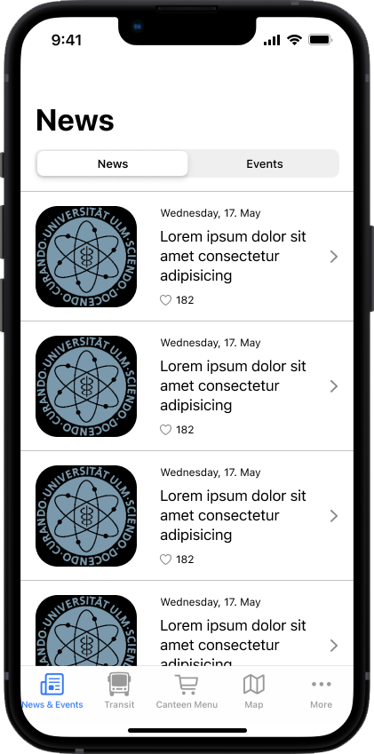
The main view of the feature is the NewsEventsMainView. This view can be found in “view” -> “screens” and embodies the main screen for the feature. The view body consists of three parts: A NavigationView to provide an adequate title, a pickerView for switching between news and events, and a switchTabView which either displays the list of news or events. NewsEventsMainView:
var body: some View {
  NavigationView {
    VStack {
      pickerView
      Spacer()
      switchTabView
        .frame(alignment: .center)
        .navigationBarTitle(Text(tabBarTitles[self.pickedTab]))
      Spacer()
    }
  }.onAppear {
    self.vm.reloadNews()
    self.vm.reloadEvents()
  }
}
The pickerView and the switchTabView are defined outside of the body to improve readability of the code.
Switching between News and Events
For switching between news and events, the pickerView is simple SwiftUI Picker with the SegmentedPickerStyle. The pickable elements of the picker are stored within a String array called tabBarTitles, which consists of “News” and “Events”. Picking one of the provided possibilities will set the pickedTab value to the index of the picket value inside the tabBarTitles array.
New Tabs can easily be added by simply adding a value to the tabBarTitles.
@State var pickedTab = 0
var tabBarTitles: [String] = ["News".localize(), "Events".localize()]

private var pickerView: some View {
  Picker(selection: self.$pickedTab, label: Text("Tab")) {
    ForEach(0..<tabBarTitles.count) { index in
      Text(self.tabBarTitles[index]).tag(index)
    }
  }
    .pickerStyle(SegmentedPickerStyle())
    .padding()
}
Based on the pickedValue var, the switchTabView will either return the list of news or the list of events. This happens via a binding so the switchTabView will react to the button change instantly and will display the correct list.
private var switchTabView: AnyView {
  switch self.pickedTab {
  case 0:
    return loadableViewNews.toAnyView()
  case 1:
    return loadableViewEvents.toAnyView()
  default:
    return EmptyView().toAnyView()
  }
}
Listing News and Events
Both the mentioned news list as well as the events list follow the same structure. They are implemented as LoadableView consisting of a List of items. The LoadableView is defined in the General Section of the project. It has different states in form of an enum. The state can be set to loading to indicate that the LoadableView is currently Loading its items. This is shown accordingly to the user. When the items are loaded, the actual content of the LoadableView is presented. In this case, it presents either the list of news or the list of events. Both lists have a pullToRefresh view modifier set, which will either re-request the news or events and overwrite the currently loaded items. List for news:
private var loadableViewNews: some View {
  LoadableView(loadable: vm.news) { news in
    List(news) { newsItem in
      self.createNewsNavigationLink(newsItem: newsItem)
        .onAppear {
          self.vm.loadMoreNewsIfNeeded(currentNewsItem: newsItem)
        }
    }
      .pullToRefresh(isShowing: self.$isRefreshing) {
          self.vm.reloadNews()
          self.isRefreshing = false
      }
      .toAnyView()
  }
}
Elements of the News- and Events- List
These lists consist of NavigationLink s which are defined by a view and a navigation target. The view for this NavigationLink is the either the NewsItemRow or the EventItemRow, depending on the picked value. Accordingly, the navigation target is either the NewsItemDetailView or the EventItemDetailView. The NavigationLink ensures that clicking on one of the Row Views will open the according detail view.
func createNewsNavigationLink(newsItem: NewsItem) -> NavigationLink<NewsItemRow, NewsItemDetailView> {
  // use same view model for Row and DetailView to ensure consistency between them
  let newsItemViewModel = NewsItemViewModel(newsItem: newsItem, appState: self.appState)
  let newsItemDetailView = NewsItemDetailView(vm: newsItemViewModel)
  let label = { NewsItemRow(vm: newsItemViewModel) }
  let link: NavigationLink<NewsItemRow, NewsItemDetailView> = NavigationLink(destination: newsItemDetailView, label: label)
  return link
}
Both the Row and the DetailView use the same viewmodel. For details on why this is the case, see the documentation about the Detail Views. As soon as the body is loaded, a number of News and Events is loaded from the backend. This is ensured by the onAppear view modifier of the NavigationView.
Loading and Handling of News and Events Data
The loading of news and events is handled within the viewmodel of the NewsEventsMainView. It is implemented as an extension to the NewsEventsMainView and can by found under “viewModels”. This viewModel holds two arrays containing the loaded news and events and is connected to the NewsWebService and the EventsWebService. For loading the news and events from the backend, the viewmodel implements different methods which call the web services and store the loaded data inside the provided arrays. For both news and events, there are 3 different methods: a reload method, a loadMoreIfNeeded method and a loadMore method. The reload method is called when the NewsEventsMainView is initialised and loads either the most up-to-date news or the events that are the first to come in the future. the loadMoreIfNeeded methods check if more items have to be loaded depending on the scroll position of the user. If he scrolls towards the end of the list, a the loadMore method is called which will load more items from the backend. The loadMore method for the news loads a number of news items older than the already loaded ones. For this purpose, the timestamp of the last news item in the list is included in the request (the “oldest” one). For the events, the loadMore method loads a number of events happening after the last one in the list (these events are further into the future).
The loaded news and events are stored within the news and events arrays which are published to the NewsEventsMainView. This is handled by Swift with the @Published annotation:.
extension NewsEventsMainView {
  class ViewModel: ObservableObject {
    @Published private(set) var news: Loadable<[NewsItem]> = .notRequested
    @Published private(set) var events: Loadable<[EventItem]> = .notRequested

    reloadNews() {...}
    loadMoreNewsIfNeeded() {...}
    ...
  }
}
The arrays are defined as Loadable as they are loaded into the LoadbleView.
The NewsEventsMainView observes these changes and will reload the view as soon as the viewmodel’s arrays change. This ensures that the view is up-to-date with the data hold by the viewmodel. Swift handles this by observing the viewmodel:
@ObservedObject var vm: ViewModel
Rows - View for List Elements
The NewsItemRow and the EventItemRow consist of a view and a viewmodel. Their views are shown inside the news list or event list and display the item of the list. The viewmodel for a item row holds either a news item or an event item. It is observed by the corresponding view.
struct NewsItemRow: View {
  @ObservedObject var vm: NewsItemViewModel
  ...
}

class NewsItemViewModel: ObservableObject {
  @Published var newsItem: NewsItem
  ...
}
The actual view only consists of view elements displaying the information held in the view model’s item. Additionally, the view also includes a ContextMenu containing the functionality provided for news- and event items.
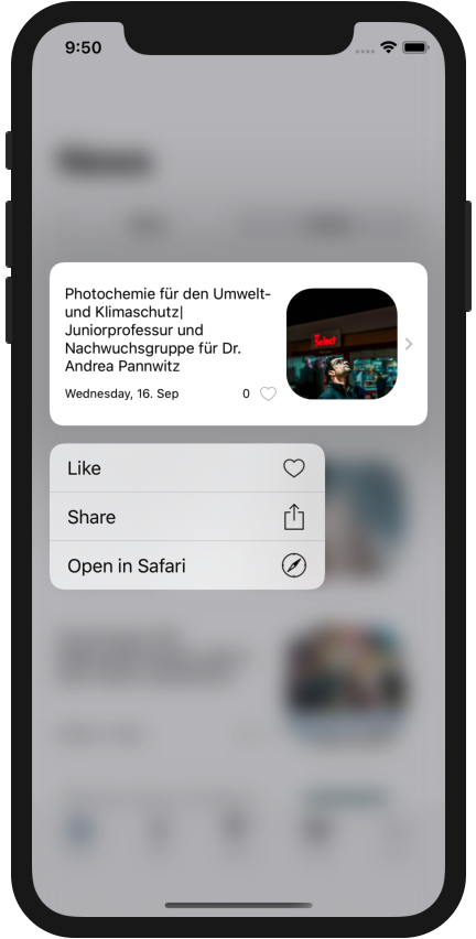
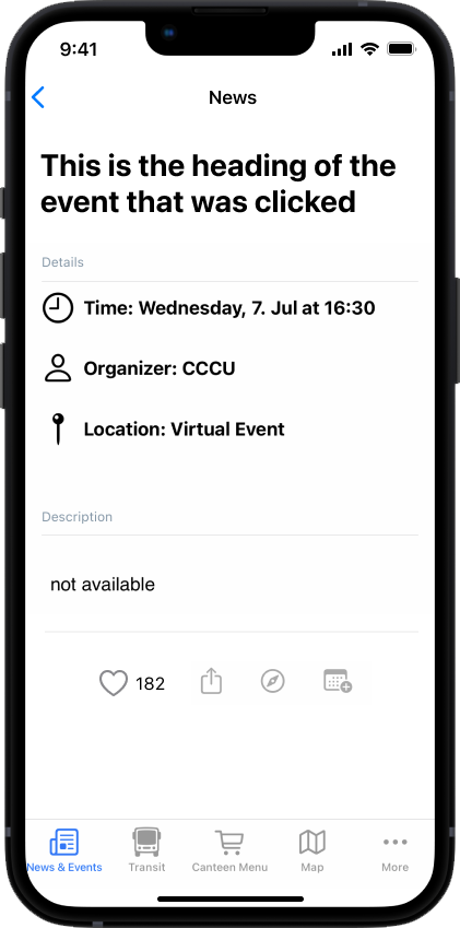
For each functionality, the contextMenu holds one button. For news, the functionalities are Like, Share and Open in Safari. Events have Set Interest, Share, Open in Safari and Add to Calendar. The Like and the Set Interest are basically the same. The buttons inside the contextMenu holding these functionalities trigger methods inside the view model in form of intents. The viewmodel also holds a reference to a web service (either NewsWebService or EventsWebService) to provide the actual functionality.
The only exception is the Share functionality. It does not trigger an intent towards the viewmodel. Instead, it triggers a ShareSheet to be shown to the user.
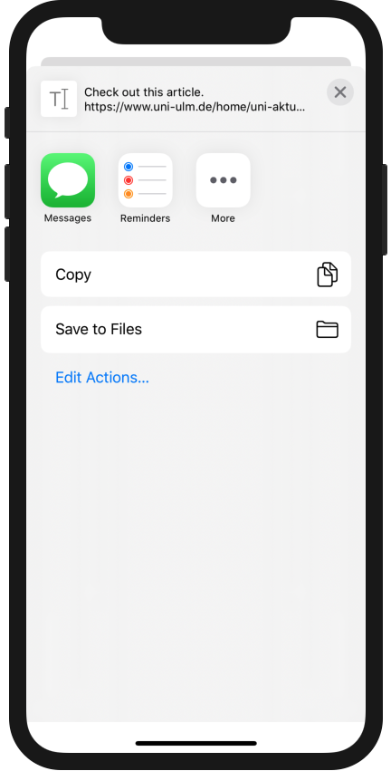
@State private var showShareSheet = false

private var contextMenu: some View {
  ...
  Button(action: {self.showShareSheet = true}, label: {
    Text("Share".localize())
    Image("share")
      .resizable()
      .frame(width: 20.0, height: 20.0)
      .foregroundColor(.lightGray)
  })
  .sheet(isPresented: $showShareSheet) {
    ShareSheet(activityItems: ["Check out this article.".localize() + "\n\(self.vm.newsItem.link ?? "not available".localize())"])
  }
  ...
}
This is needed since SwiftUI does not yet provide a smooth way to implement a share functionality. However, UIKit does provide this functionality. The ShareSheet used here is a simple wrapper for the UIKit Share functionality for SwiftUI. It uses a UIActivityViewController to show the ShareSheet and provide the share functionality. When the Share button is pressed, the showShareSheet boolean is simply set to true. The .sheet view modifier has a binding to this variable and will trigger the showing of the ShareSheet Dismissing the ShareSheet is automatically handled by the ShareSheet itself.
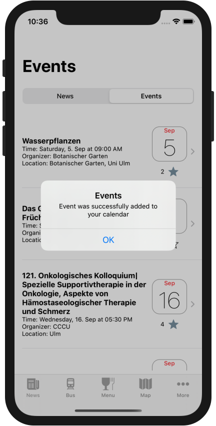
As the Add to Calendar functionality accesses the calendar application, it is necessary to request permission for the access. If permission is granted, the calendar can be accessed and an event is created.
let eventStore: EKEventStore = EKEventStore()
eventStore.requestAccess(to: .event) { (granted, error) in
  if granted && error == nil {
    // access to event store is granted and no error is present
    // prepare event
    let event: EKEvent = EKEvent(eventStore: eventStore)
    event.title =
          ...

    do {
        // try to save the event to the event store
        try eventStore.save(event, span: .thisEvent)
    } catch {
        // show error
        self.showAlert(title: "Unable to save event to calendar".localize())
    }
    self.showAlert(title: "Events".localize(),
    message: "Event was successfully added to your calendar".localize())
  } else {
    // access rights for event store were not granted. Show error.
    self.showAlert(title: "Unable to save event to calendar".localize())
  }
}
Detailed Views for News and Events
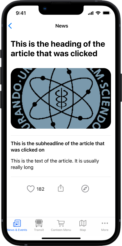
The NewsItemDetailView and the EventItemDetailView provide detailed information about the corresponding News or Event. They consist of a Scrollview, which holds all view elements presenting the information. Additionally, they also hold buttons at the end of the scrollview providing the same functionality as the context menu. Since they share the exact same functionality as the context menu (which is included inside the Row views), the use the same viewmodel as the corresponding Row. This also ensures that liking inside the detail view will also update the row inside the list and vice versa.
Presenting Success and Failure
After performing one of the possible user actions, the view model tells the view to display an error or success message.

For this, the viewmodel publishes a value called showAlert and holds two accessible Strings: the alertTitle and the alertMessage When the showAlert Bool is set to true, the view will get notified and will display an error containing the alertTitle and the alertMessage of the viewmodel.
struct NewsItemRow: View {
  @ObservedObject var vm: ViewModel

  var body: some View {
    HStack(alignment: .center) {
      ...
    }
      .alert(isPresented: Binding<Bool>(
        get: { self.vm.showingAlert },
        set: { _ in self.vm.showingAlert = false }
      )) {
        Alert(title: Text(self.vm.alertTitle),
          message: Text(self.vm.alertMessage ?? ""),
          dismissButton: .default(Text("OK")))
      }
  }
}

extension EventItemRow {
  class ViewModel: ObservableObject {
    @Published var showingAlert = false
    var alertTitle: String = ""
    var alertMessage: String?

    ...

    func showAlert(title: String, message: String? = nil) {
      alertTitle = title
      alertMessage = message
      DispatchQueue.main.async {
        self.showingAlert = true
      }
    }
  }
}
More
The more tab is the place where the user can find all the other features of the app. The user has the ability to change which features are located at the bottom. The rest is located in the more tab.
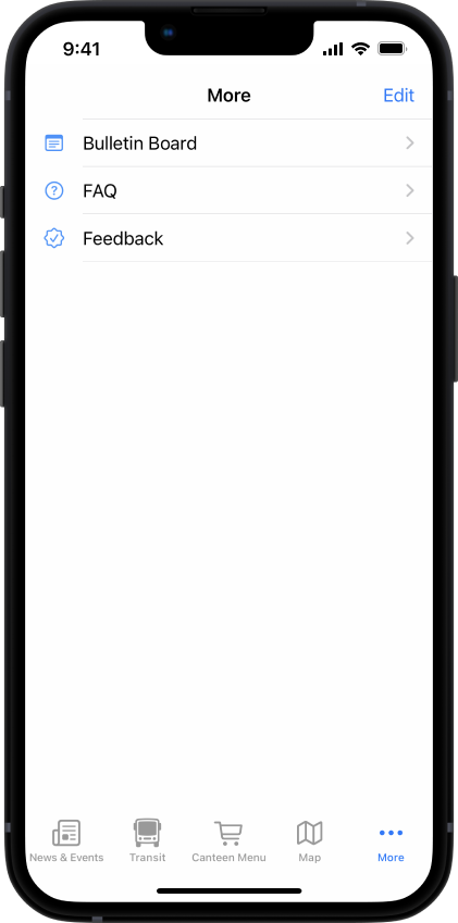
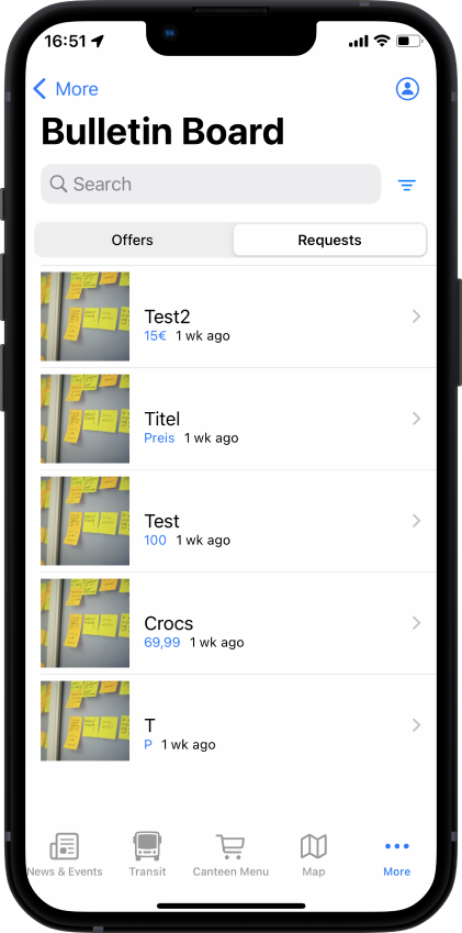
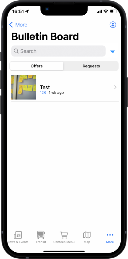
Bulletin Board
The Bulletin Board is a feature that allows users to post adverts. The Bulletin Board is accessible from the More tab. It is a list of adverts, which can be filtered by category. The adverts can be sorted by date or by distance. The user can also create a new advert or edit an existing one.
The Bulletin Board is implemented as a TabView.
TabView {
  BulletinBoardView()
    .tabItem {
      Image("bulletin_board")
      Text("Bulletin Board".localize())
    }
  ...
}
The BulletinBoardRow is a View that displays the title, the category and the date of the advert.
The BulletinBoardView is implemented as a View.
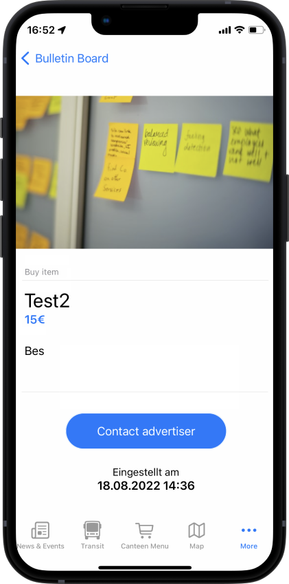
The BulletinBoardDetailView is implemented as a View. It displays the title, the category, the date, the description and the contact information of the advert.
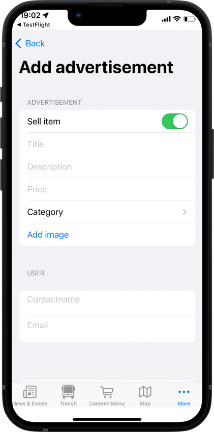
The BulletinBoardEditView is implemented as a View. It allows the user to create a new advert or edit an existing one. The user can enter the title, the category, the description and the contact information of the advert.
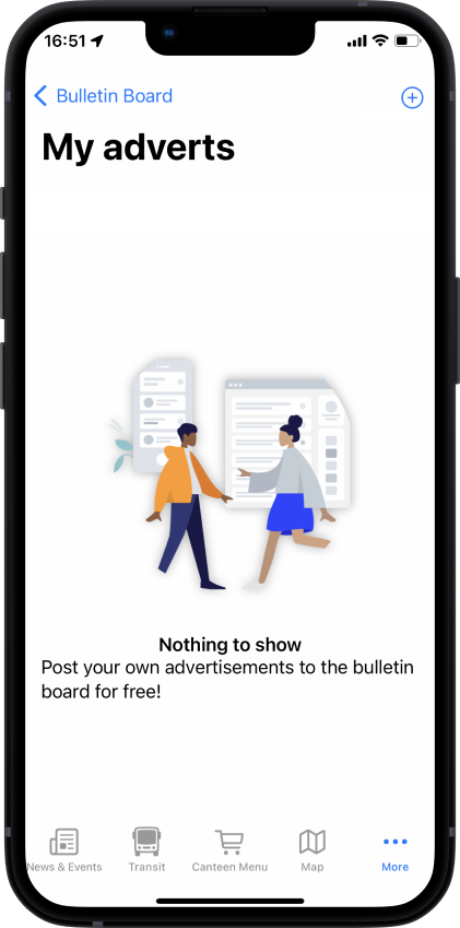
The MyAdvertisementsView is implemented as a View. It displays all the adverts created by the user. The user can edit or delete an advert.
Feedback
The Feedback feature allows users to send feedback to the app developers. The Feedback feature is accessible from the More tab. It is a form that allows the user to enter the feedback and the contact information.
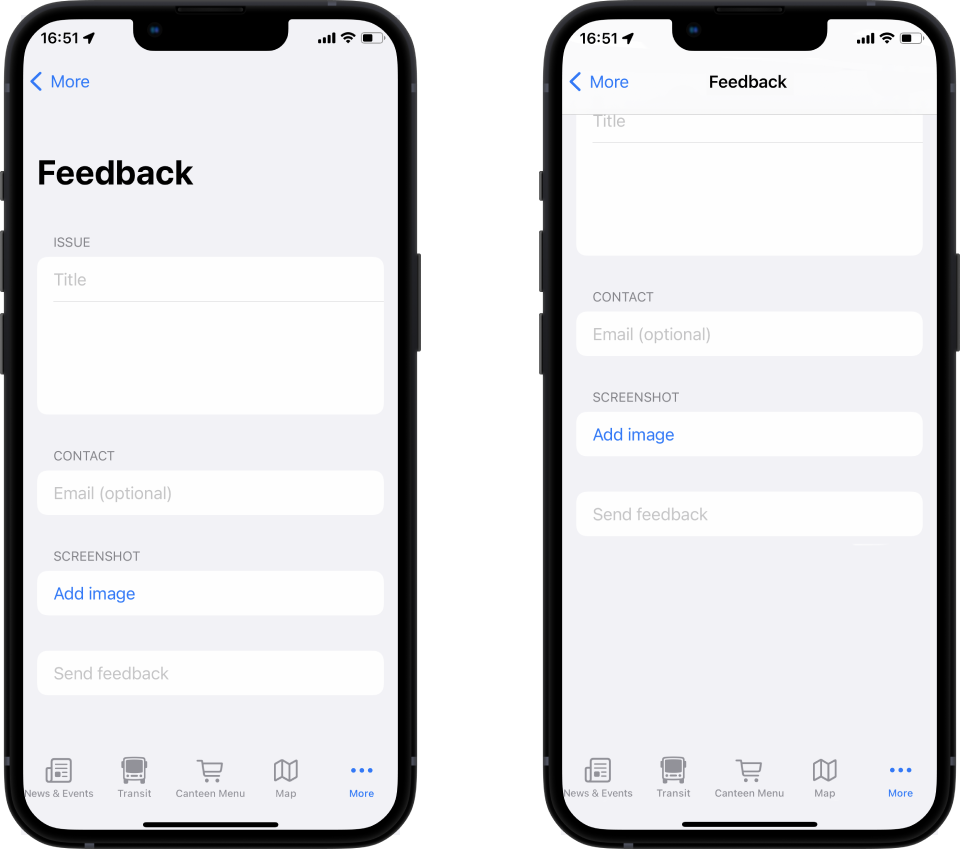
The FeedbackView is implemented as a View. It displays a form that allows the user to enter the feedback and the contact information.
Public Transit
The Public Transit feature allows users to find the next public transit at the nearest stop or their favorite stop.
ToDo
Some features are still in development and will be added in the future.
[ ] Map
[ ] Cantine
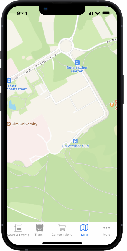
Map
The Map feature will allow the user to see the location of the different buildings on campus. It can also help navigate the user to a specific building.
Cantine
The cantine feature will allow the user to see the menu of the cantine.
Testflight Release
This is a step-by-step tutorial on how to distribute your app on TestFlight. If you have problems, please look at https://www.ralfebert.de/ios/testflight-tutorial/ or similar pages.
The following will describe the necessary steps to publish an app version in TestFlight. Testflight is a tool for testing beta versions of apps and is useful for collecting feedback before releasing an application in the App Store.
Before you start
Log In
Before you start uploading your newest release, you have to log in to your developer account. Therefore, use the credentials the project owner will hand out to you. On the menu bar click on XCode > Preferences and navigate to Account. Then log in using the given credentials.
Note
Due to 2FA it may happen that you have to provide a 6-digit number that is sent to the main-device of the product owner. If so, please contact the product owner.
Organise upload
For uploading your newest release, make sure your branch is up to date and that you are on the dev branch. Also ensure that your current version is working and not crashing or lagging on tests.
Upload new version
Create archive
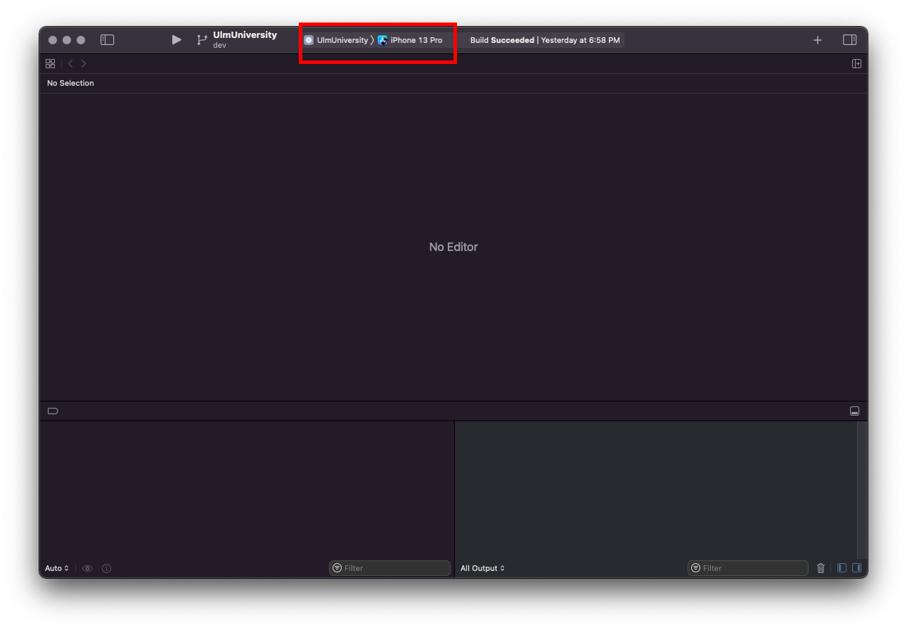
In order to create an archive, first check that your app can be run on any iOS device. Therefore choose “Any iOS device” in the Simulator Settings.
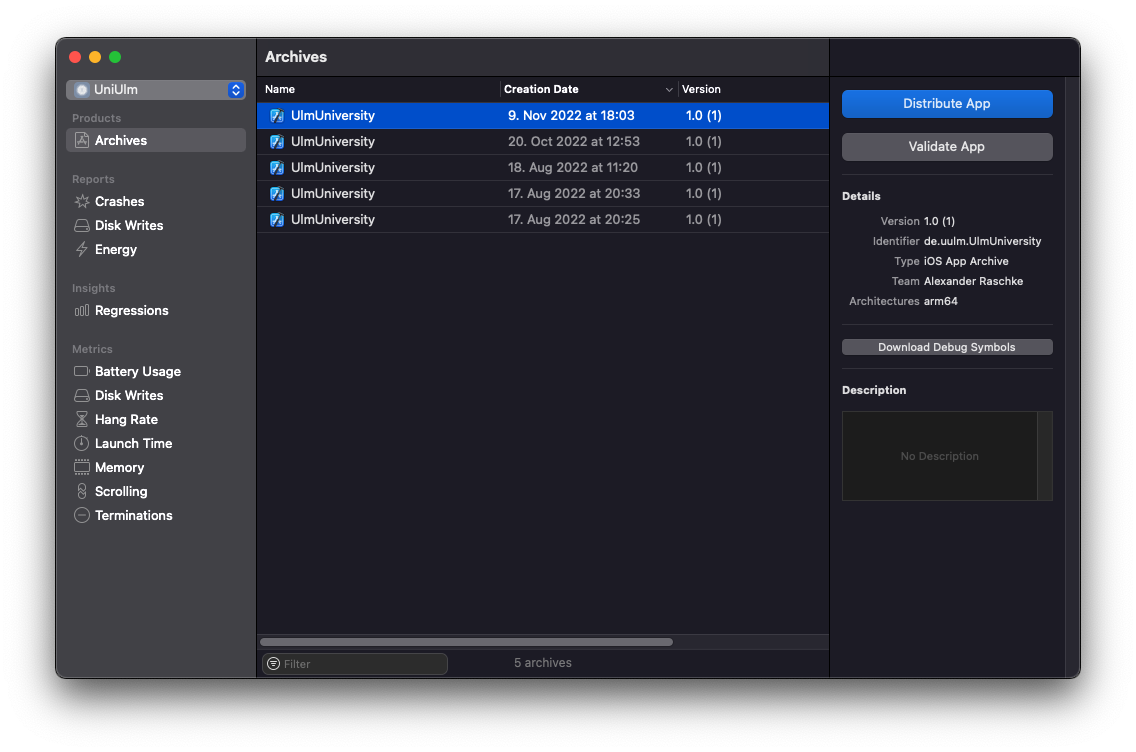
Afterwards, navigate to Product > Archive in the top bar. After a moment the archive should be build successfully and the Organizer window shows up. If not, you can open it manually via Window > Organizer.
Distribute app
In the Organizer the latest archives are listed. Choose the latest created version for your release. Then click on Distribute App.
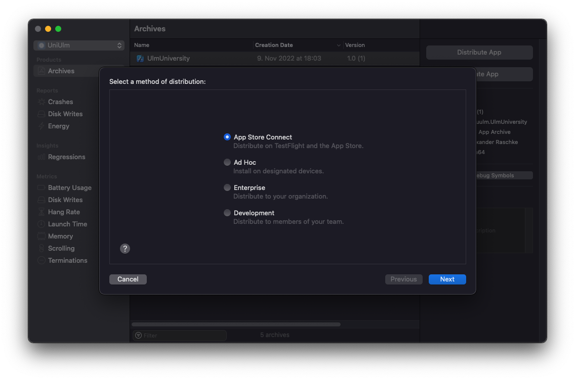
Afterwards you have to choose the method of distribution. Here, select AppStore Connect.
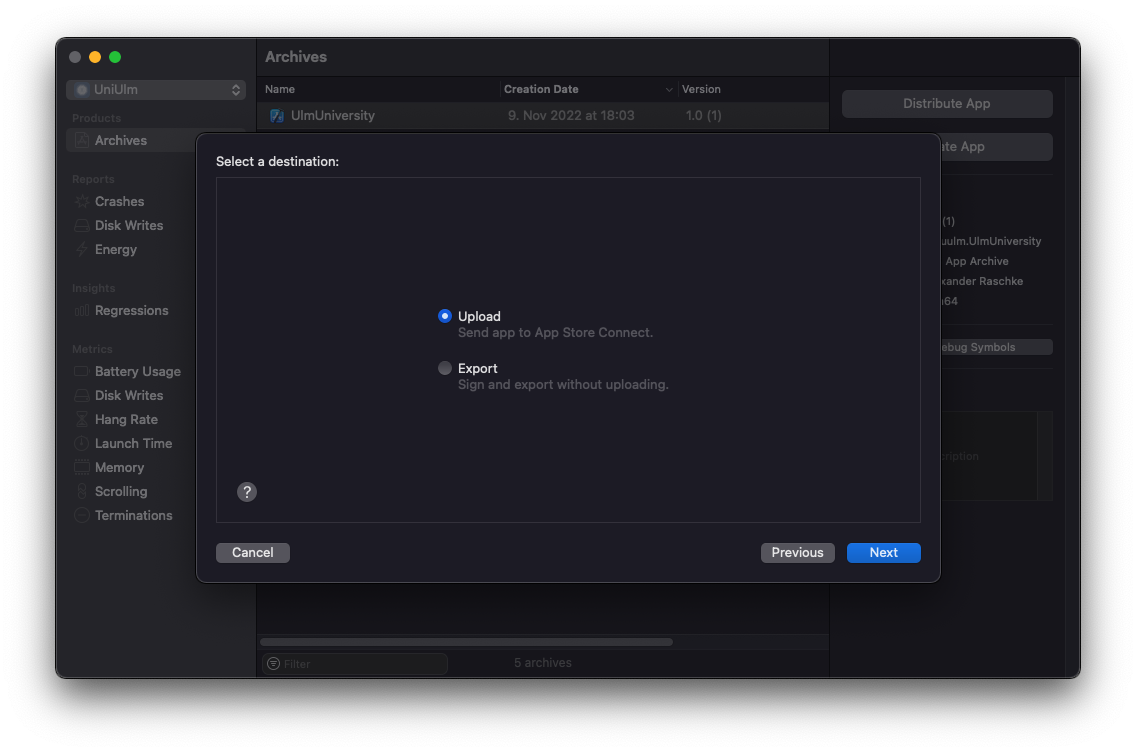
Next, you have to choose a destination. Here, check Upload.
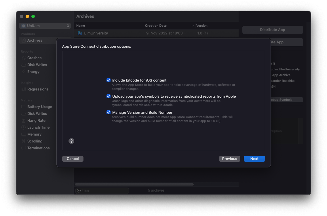
Now you can select special options for you App Store Connect distribution. Make sure, all three options are checked.
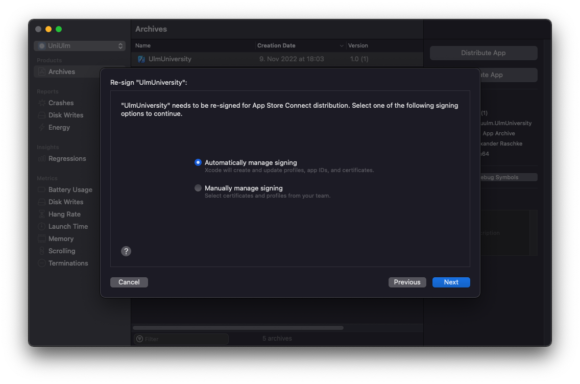
Finally, the application asks to re-sign the release version for your App Store Connect distribution. Make sure, that your project is automatically signed.
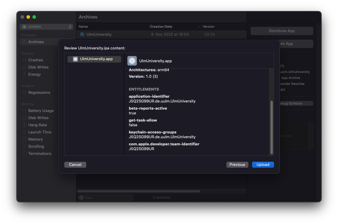
Now you can upload your version to App Store Connect.
Lastly, log in to the Apple App Store Connect account (2FA may be needed) and make sure the latest version was successfully uploaded. After publishing it, you can add the development team for testing.